Tools
CHOMP
CHANGE

A mobile first responsive website that enables users to generate budget first grocery lists and then pulls simple recipes from those lists for easy meal prep, saving users time and money.
Role
Sole Designer
Feature Concept
UX Research
Branding
Prototyping
User Testing

Adobe Suite
Miro
Figma
Overview
This was my very first UX Bootcamp project where I selected the course category of "taking care of one's health". As a student I was solely responsible for coordinating and executing all phases of this project from ideation all the way to prototyping and usability testing. It was an excellent exercise in human centered design as well as developing my foundational skillset for UI / UX.
Americans struggle to balance budget and nutrition when it comes to personal meal planning.
Duration
3 months
My Solution
My solution was to create a mobile first responsive website that utilizes API integrations and AI assistance to generate budget-tailored shopping lists and simple recipes.
Problem
CHOMP
CHANGE
A mobile first responsive website that enables users to generate budget first grocery lists and then pulls simple recipes from those lists for easy meal prep, saving users time and money.
Tools
Role
Sole Designer
Feature Concept
UX Research
Branding
Prototyping
User Testing
Figma
Adobe Illustrator
Adobe Photoshop

Before I could start designing I needed to understand:
How does meal planning fit into daily life for users?
Why might participants not be cooking for themselves?
How can I prioritize user needs around meal planning?
Are there additional barriers preventing users from making healthier decisions?

TABLE OF CONTENTS
Research
Data Synthesis
Usability Testing
Visual Design
Key Takeaways

Strengths:
Mission-driven (Non profit)
Resource rich
Localized content
Weaknesses:
Limited Scalability
Less focus on advanced technology
Mostly topic articles / No interactive features
Competitor #1

Strengths:
Authority and Trustworthiness
Clear, practical guidelines
Accessibility Standards
Weaknesses:
Limited Engagement
Outdated content due to bureaucratic process
Content is too broad and generic/foundational
Competitor #2
Strengths:
Community driven content
Real-Time Interaction
Engagement and Motivation
Weaknesses:
Variable content quality
Lack of structure and organization
Limited control over user experience

/r/eatcheapandhealthy
Competitor #3
RESEARCH
Content Auditing & Competitive Analysis
I surveyed existing resources and information and to verify whether or not I am creating a solution for a problem that actually exists (it does). I then took the biggest players of the relevant content and shifted my perspective to view them as competitors for user engagement. I realized these key takeaways
View Full Analysis
KEY TAKEAWAYS:
Existing resources do well by community discussion, content abundance, and accessibility.
There is room for improvement by tailoring lists to more specific budgets and dietary restrictions. Chomp Change would be first of its kind to generate such lists with API and AI integration.
Click to enlarge


“Grocery costs these days are ridiculous”
“I just don’t have the time for preparing elaborate meals”
What's the point? Eating out is quicker and costs about the same these days."
RESEARCH
User Interviews
I then conducted user interviews with 7 participants of varying ages and employment status to understand their values, motivations, and frustrations around personal nutrition. I conducted the interviews remotely with Google Meetings over the course of 4 days.
KEY TAKEAWAYS
All participants desired to make more nutritious meal choices
Two main inhibitors prevented them from doing so:
COST
TIME

Click to enlarge

DATA SYNTHESIS
I reworked my research with the following methods to ensure that my takeaways stood up to scrutiny. I also participated in some brain storming exercises per the course curriculum to exercise my creative thinking skills being as this was an introductory project for new designers. You can click on the thumbnails to view the full images.


Creative Exercise
New skill realized: I have a knack for contrary ideas
Project Goals
I assessed and organized goals of the user business and technical considerations to prioritize features for Chomp Change
Affinity Mapping
I further identified and organized themes and user pain points to inform design

Personas
I created personas based on interview data for reference so I could design keeping their needs in mind

Story Boarding
I Illustrated scenarios to better understand users' frustrations and pain points

Analogous Inspiration
I mapped out what methods competitors are using to differentiate where I can improve


PAPER BEFORE PIXELS

I start all my designs in sketch to start developing a structure before moving into mid fidelity and the first round of user testing. I learned a lot through rapidly iterating from low fidelity to high fidelity designs. Swipe through this carousel to see how screens changed and how these changes contributed to my growth as a new designer.
There was a disconnect between my personas and my initial concepts; my participants were pressed for time and I had created extra steps in the task flow. I learned quickly the value of listening to direct user feedback to guide my decision making.
(Click on images to enlarge them)

PAPER BEFORE PIXELS
Users mistook the budget display to be an element they could click or type into because I put it in a box! I learned to be more aware of existing design patterns and that using them in different ways may confuse users.
(Click on images to enlarge them)


PAPER BEFORE PIXELS
I initially designed everything to have fixed layouts. I spent a lot of time trying to "fit" everything on one screen. This was due to my then inexperience with interactive design. I learned to take technical considerations and developers into account - hence the addition of an overlayed navigation bar.


(Click on images to enlarge them)
RESPONSIVE DESIGN
One aspect of this project was to introduce us to and develop our understanding and skillset around responsive design. The course required us to investigate what other devices our participants used and create the correlating responsive mid-fidelity screen for one task. I was a bit surprised to learn how uncommon desktop browsing is becoming for people who do not need desktop computers for their jobs as my participants used tablets for their secondary devices. Moving forward in the course I was instructed to conduct my user testing on the screen they used the most (mobile) so these tablet screens were not included in user testing though I did find it to be a good foundational exercise in adjusting layouts for varying screen sizes.
IDEATION to PRIORITIZATION
I created a feature set based around my user research and their needs, prioritizing features that were most relevant to their pain points: Generate a budget tailored shopping list, and easily generate recipes based on that list. I created site maps to structure what my users' flows would look like, and what steps they needed to take to use my key features.


User Flow for generating a New List
User Flow for generating a Recipe
Task Flows for more features
I didn't get to build all of these out as I had to choose two hero features per the course curriculum
RESPONSIVE DESIGN
One aspect of this project was to introduce us to and develop our understanding and skillset around responsive design. The course required us to investigate what other devices our participants used and create the correlating responsive mid-fidelity screen for one task. I was a bit surprised to learn how uncommon desktop browsing is becoming for people who do not need desktop computers for their jobs as my participants used tablets for their secondary devices. Moving forward in the course I was instructed to conduct my user testing on the screen they used the most (mobile) so these tablet screens were not included in user testing though I did find it to be a good foundational exercise in adjusting layouts for varying screen sizes.


LOW FIDELITY


HIGH FIDELITY
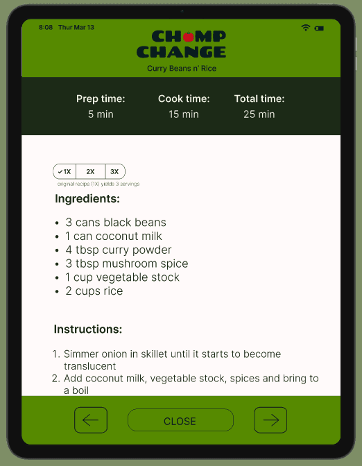
USABILTY TESTING
Screens continued to better adapt to user needs after conducting additional testing with the high fidelity version of my screens. 7 participants used my prototype to accomplish the following:
Generate a shopping list
Swap a shopping list item for something else
Generate recipes
I used prompts, duration timing, and task completion as my success metrics.
Swipe to see more iterations!

Most participants did not have allergies or dietary restrictions. This was adding a lot of time to users' duration of testing. My verbiage was also not obvious enough to users.

Testing screen
So I adapted the flow to prompt users for dietary restrictions first to skip the step entirely for those whom it did not apply
Iterated
USABILTY TESTING
Some participants did not understand the functions of this button. I explored some different layouts but I wanted this screen to say as simple as possible to mimic the feel of a paper list.

Testing screen
Iterated
So I hired a little help to show users around.
USABILTY TESTING

Testing screen
Iterated

So I tweaked the content strategy to be more specific.
Users did not understand the function of this. My idea was to make an obvious way to indicate that the recipe was pulling ingredients from their last shopping trip and updating the "inventory" in real time.
CHOMP CHANGE VISUAL DESIGN
My idea for Chomp Change was to use color palettes that are associated with freshness and health. I initially started with a mint color palette but found it to be washed out when applied to my screens.
Course material required us to create a style tile before high fidelity mockups which I struggled with because I felt I was choosing colors out of context. Once I started applying the colors to the interface I made a lot of adjustments and shifted my direction to colors associated with produce to help drive the idea that Chomp Change is health oriented.
I also wanted the site to feel light hearted to encourage and delight users who felt intimidated by cooking and meal preparing, hence the illustrative style.

Logo Exploration
The "O" in Chomp Change was an easy target for play. I experimented with different veggies but ultimately chose the tomato because I felt the product name is very strong and didn't want to over do it.
First Style Tile
I really liked my color choices until I started adding them to the interface. It felt too washed out!
Mood Board
Striving for fresh, light hearted, fun.Illustrations to Delight
I really enjoyed adding an illustrative flair to Chomp Change to further drive the branding.
CH MP CHANGE VISUAL DESIGN
My idea for Chomp Change was to use color palettes that are associated with freshness and health. I initially started with a mint color palette but found it to be washed out when applied to my screens.
Course material required us to create a style tile before high fidelity mockups which I struggled with because I felt I was choosing colors out of context. Once I started applying the colors to the interface I made a lot of adjustments and shifted my direction to colors associated with produce to help drive the idea that Chomp Change is health oriented.
I also wanted the site to feel light hearted to encourage and delight users who felt intimidated by cooking and meal preparing, hence the illustrative style.

Mood Board
Striving for fresh, light hearted, fun.
Logo Exploration
The "O" in Chomp Change was an easy target for play. I experimented with different veggies but ultimately chose the tomato because I felt the product name is very strong and didn't want to over do it.
First Style Tile
I really liked my color choices until I started adding them to the interface. It felt too washed out!
Illustrations to Delight
I really enjoyed adding an illustrative flair to Chomp Change to further drive the branding.
A mobile first responsive website that aids people in making healthy and budget friendly meal planning. Start the video to view this prototype in action!
A mobile first responsive website that aids people in making healthy and budget friendly meal planning. Start the video to view this prototype in action!
FINAL PROTOTYPE
FINAL PROTOTYPE
KEY TAKEAWAYS FOR MYSELF AS A DESIGNER
Learning new software was initially challenging but I loved exploring informational resources and really immersing myself in user interface design.
New skills acquired! Miro, Figma/Figjam, Prototyping.
I am very proud of the overall brand identity. I was surprised by how well my illustration skills complement UI design and delighted to realize supporting those skills can be.
I genuinely enjoyed this process, pleased with how my experience in customer service translates to the user research world. I finished this project feeling very inspired about this career change into design.

KEY TAKEAWAYS FOR MYSELF AS A DESIGNER
Learning new software was initially challenging but I loved exploring informational resources and really immersing myself in user interface design.
New skills acquired! Miro, Figma/Figjam, Prototyping.
I am very proud of the overall brand identity. I was surprised by how well my illustration skills complement UI design and delighted to realize how supporting those skills can be.
I genuinely enjoyed this process, pleased with how my experience in customer service translates to the user research world. I finished this project feeling very inspired about this career change into design.
Back to Top
Overview
This was my very first UX Bootcamp project where I selected the course category of "taking care of one's health". As a student I was solely responsible for coordinating and executing all phases of this project from ideation all the way to prototyping and usability testing. It was an excellent exercise in human centered design as well as developing my foundational skillset for UI / UX.
Duration
3 months
Problem
My Solution
My solution was to create a mobile first responsive website that utilizes API integrations and AI assistance to generate budget-tailored shopping lists and simple recipes.
Americans struggle to balance budget and nutrition when it comes to personal meal planning.
Before I could start designing I needed to understand:
How does meal planning fit into daily life for users?
Determine why users may not be cooking for themselves
How can I prioritize user needs around meal planning?
Are there additional barriers preventing users from making healthier decisions?
RESEARCH
Content Auditing & Competitive Analysis
I surveyed existing resources and information and to verify whether or not I am creating a solution for a problem that actually exists (it does). I then took the biggest players of the relevant content and shifted my perspective to view them as competitors for user engagement. I realized these key takeaways
Strengths:
Mission-driven (Non profit)
Resource rich
Localized content
Weaknesses:
Limited Scalability
Less focus on advanced technology
Mostly topic articles / No interactive features
Strengths:
Authority and Trustworthiness
Clear, practical guidelines
Accessibility Standards
Weaknesses:
Limited Engagement
Outdated content due to bureaucratic process
Content is too broad and generic/foundational
Strengths:
Community driven content
Real-Time Interaction
Engagement and Motivation
Weaknesses:
Variable content quality
Lack of structure and organization
Limited control over user experience
/r/eatcheapandhealthy
KEY TAKEAWAYS
Existing resources do well by community discussion, content abundance, and accessibility.
There is room for improvement by tailoring lists to more specific budgets and dietary restrictions. Chomp Change would be first of its kind to generate such lists with API and AI integration.
RESEARCH
User Interviews
I then conducted user interviews with 7 participants of varying ages and employment status to understand their values, motivations, and frustrations around personal nutrition. I conducted the interviews remotely with Google Meetings over the course of 4 days.
What's the point? Eating out is quicker and costs about the same these days."
“I just don’t have the time for preparing elaborate meals”
“Grocery costs these days are ridiculous”
KEY TAKEAWAYS
All participants desired to make more nutritious meal choices
Two main inhibitors prevented them from doing so:
COST
TIME
DATA SYNTHESIS
I reworked my research with the following methods to ensure that my takeaways stood up to scrutiny. I also participated in some brain storming exercises per the course curriculum to exercise my creative thinking skills being as this was an introductory project for new designers.
Project Goals
I assessed and organized goals of the user business and technical considerations to prioritize features for Chomp ChangeCreative Exercise
New skill realized: I have a knack for contrary ideasPersonas
I created personas based on interview data for reference so I could design keeping their needs in mindStory Boarding
I Illustrated scenarios to better understand users' frustrations and pain pointsAffinity Mapping
I further identified and organized themes and user pain points to inform design
IDEATION to PRIORITIZATION
I created a feature set based around my user research and their needs, prioritizing features that were most relevant to their pain points: Generate a budget tailored shopping list, and easily generate recipes based on that list. I created site maps to structure what my users' flows would look like, and what steps they needed to take to use my key features.
User Flow for generating a New List
User Flow for generating a Recipe
Task Flows for more features
I didn't get to build all of these out as I had to choose two hero features per the course curriculum
Paper before Pixels
I start all my designs in sketch to start developing a structure before moving into mid fidelity and the first round of user testing. I learned a lot through rapidly iterating from low fidelity to high fidelity designs. Swipe the screens below to see how they changed and how these changes contributed to my growth as a new designer.
There was a disconnect between my personas and my initial concepts; my participants were pressed for time and I had created extra steps in the task flow. I learned quickly the value of listening to direct user feedback to guide my decision making.
Users mistook the budget display to be an element they could click or type into because I put it in a box! I learned to be more aware of existing design patterns and that using them in different ways may confuse users.
I initially designed everything to have fixed layouts. I spent a lot of time trying to "fit" everything on one screen. This was due to my then inexperience with interactive design. I learned to take technical considerations and developers into account - hence the addition of an overlayed navigation bar.
USABILTY TESTING
Screens continued to better adapt to user needs after conducting additional testing with the high fidelity version of my screens. 7 participants used my prototype to accomplish the following:
Generate a shopping list
Swap a shopping list item for something else
Generate recipes
I used prompts, duration timing, and task completion as my success metrics.
Swipe to see more iterations!
Testing screen
Most participants did not have allergies or dietary restrictions. This was adding a lot of time to users' duration of testing. My verbiage was also not obvious enough to users.
So I adapted the flow to prompt users for dietary restrictions first to skip the step entirely for those whom it did not apply
Iterated
Some participants did not understand the functions of this button. I explored some different layouts but I wanted this screen to say as simple as possible to mimic the feel of a paper list.
Testing screen
So I hired a little help to show users around.
Iterated
Testing screen
Users did not understand the function of this. My idea was to make an obvious way to indicate that the recipe was pulling ingredients from their last shopping trip and updating the "inventory" in real time.
Iterated
So I tweaked the content strategy to be more specific.
Back to Top